By Spradling | Roberts Team
Color is the fastest, most affordable way to change how a home feels — and one of the most commonly mishandled decisions homeowners make. We've walked through thousands of Chicago homes across the Gold Coast, Lincoln Park, River North, and beyond, and the rooms that consistently make the strongest impression on buyers are the ones where color is intentional rather than accidental. Here's what color science actually tells us and how to apply it in your Chicago home.
Key Takeaways
-
Color directly affects mood, perceived space, and how long people want to spend in a room.
-
Chicago's limited natural light in winter months makes color selection especially consequential here.
-
Warm neutrals and earthy tones photograph well and appeal broadly to luxury buyers in Chicago's market.
-
Accent choices — on a single wall, in trim, or in a front door — can do as much work as a full repaint.
Understanding Warm vs. Cool: The Core Distinction
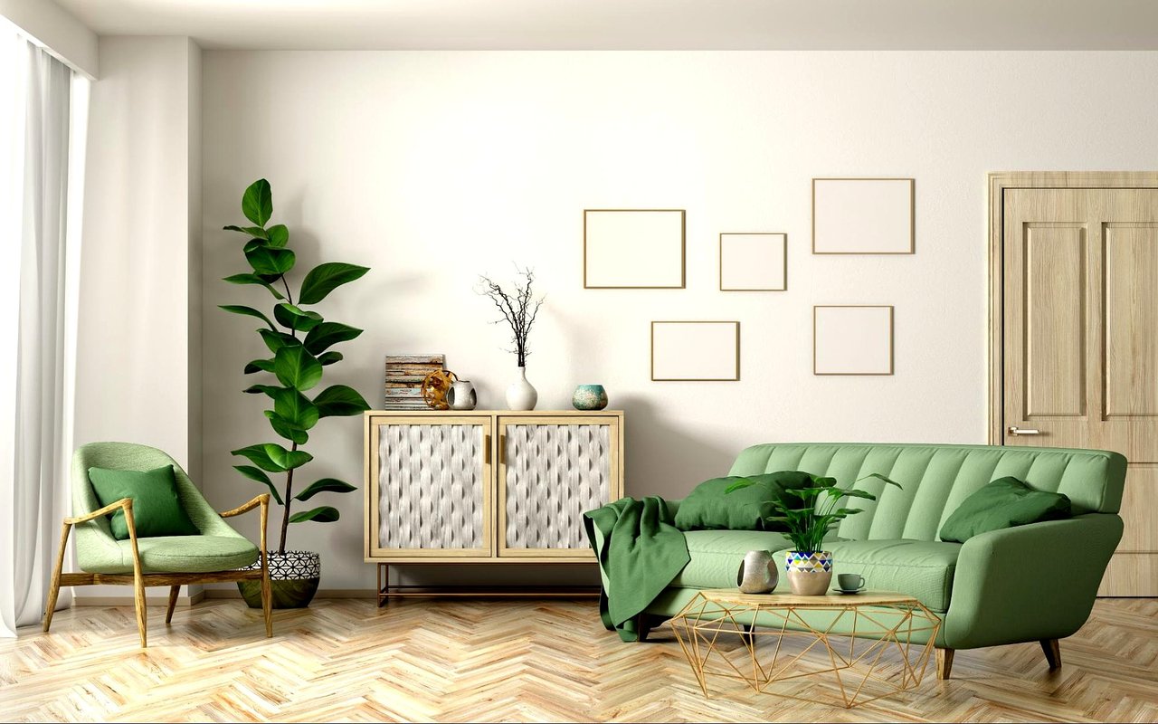
Every color sits on a spectrum from warm to cool, and that distinction determines how a room feels more than the specific hue does. Warm colors — reds, oranges, yellows, and warm-toned neutrals like cream, wheat, and warm white — create feelings of energy, welcome, and coziness. Cool colors — blues, greens, grays, and blue-toned neutrals — promote calm, focus, and a sense of openness.
In Chicago, where natural light is limited for months at a time and many homes face north or are shaded by neighboring buildings, cool gray palettes that looked appealing in California or Texas can read as bleak and flat. Warm neutrals — greige, warm white, soft taupe — hold their character through Chicago's gray winter days in a way that cool tones often don't.
In Chicago, where natural light is limited for months at a time and many homes face north or are shaded by neighboring buildings, cool gray palettes that looked appealing in California or Texas can read as bleak and flat. Warm neutrals — greige, warm white, soft taupe — hold their character through Chicago's gray winter days in a way that cool tones often don't.
Matching Color Temperature to Room Function
-
Bedrooms — cool, muted tones for rest; soft blue-gray, sage, or warm lavender
-
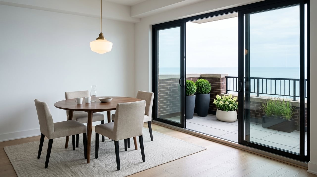
Living and dining rooms — warm neutrals for gathering; greige, cream, warm taupe
-
Home offices — medium blue or green for focus without coldness
-
Entryways — warm, welcoming tones that set expectations for the whole home
How Chicago Homes and Light Interact With Color
Light is the single most important variable in how a paint color performs, and Chicago's light is specific. North-facing rooms in Lincoln Park brownstones and Gold Coast high-rises receive cool, indirect light year-round — colors that look balanced in a sun-drenched showroom will read cooler and grayer in these rooms. South-facing rooms get warmer, more direct light that can intensify warm tones.
The practical implication: before committing to any color, buy samples and paint large swatches — at least 12 by 12 inches — on the actual wall. Evaluate them at multiple times of day. A color that reads as a perfect warm white at noon may appear yellow by lamplight or gray on an overcast Chicago afternoon.
The practical implication: before committing to any color, buy samples and paint large swatches — at least 12 by 12 inches — on the actual wall. Evaluate them at multiple times of day. A color that reads as a perfect warm white at noon may appear yellow by lamplight or gray on an overcast Chicago afternoon.
How Light Direction Affects Color Choice in Chicago Rooms
-
North-facing rooms — choose warmer tones to compensate for cool indirect light
-
South-facing rooms — can handle cooler tones without them reading flat
-
East-facing rooms — warm morning light shifts to cooler afternoon; test accordingly
-
Rooms with city views and limited sky — compensate with warmer, lighter tones on walls
Perceived Space: Using Color to Change a Room's Dimensions
Color directly affects how large or small a room appears. Lighter colors reflect light and make walls recede, creating openness. Darker colors absorb light and bring walls forward, creating intimacy. This is useful to know in Chicago, where urban square footage is often at a premium — particularly in condo buildings in River North, Lakeshore East, and the West Loop.
In smaller rooms, painting the ceiling the same color as the walls eliminates the visual break that makes rooms feel lower and more confined. In larger open-plan spaces, a deeper accent tone on one wall creates definition and makes the space feel more intentional. Both techniques are straightforward, low-cost, and reliably effective.
In smaller rooms, painting the ceiling the same color as the walls eliminates the visual break that makes rooms feel lower and more confined. In larger open-plan spaces, a deeper accent tone on one wall creates definition and makes the space feel more intentional. Both techniques are straightforward, low-cost, and reliably effective.
Color Rules for Chicago's Varied Floor Plans
-
Small condos and rooms — use lighter tones and match ceiling to walls for maximum openness
-
Large open-plan spaces — introduce a deeper accent tone to create zones and warmth
-
Rooms with low ceilings — avoid dark ceilings; keep them lighter than walls
-
Long, narrow rooms — paint the shorter end walls a slightly deeper tone to improve proportions
Choosing Color for Resale: What Chicago Buyers Respond To
When we prepare listings across Chicago's top neighborhoods, color is one of the first conversations we have with sellers. The homes that photograph best and generate the strongest buyer responses are almost always in warm, current neutrals — not stark white, not dated beige, and not bold statement colors that narrow buyer appeal.
Warm greige — a blend of gray and beige with warm undertones — is the most consistently effective resale palette across Chicago's luxury market. It reads as current, complements the warm-toned hardwood floors common in Chicago's vintage homes, and lets buyers project their own furnishings onto the space. Crisp white trim against a warm wall color is the combination that photographs most strongly and holds up across all the different lighting conditions that show up in listing photography.
Warm greige — a blend of gray and beige with warm undertones — is the most consistently effective resale palette across Chicago's luxury market. It reads as current, complements the warm-toned hardwood floors common in Chicago's vintage homes, and lets buyers project their own furnishings onto the space. Crisp white trim against a warm wall color is the combination that photographs most strongly and holds up across all the different lighting conditions that show up in listing photography.
Resale-Ready Color Choices for Chicago Homes
-
Walls: warm greige, soft taupe, or warm white with clear warm undertones
-
Trim: crisp bright white or off-white — the contrast reads well in photos and in person
-
Accent walls: deeper tones in the same warm family, not contrasting cool tones
-
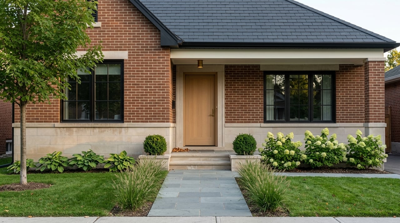
Front door: a bold but classic choice — black, navy, or deep forest green adds strong curb appeal
Frequently Asked Questions
How do I choose between warm white and greige for my Chicago home?
Test both in the actual room with large samples. Warm white works best in rooms with good natural light and warmer-toned floors. Greige is more forgiving in north-facing rooms and spaces with cooler or more limited light — it holds its warmth even when light conditions shift. In Chicago, greige tends to perform more reliably across the range of lighting conditions you'll encounter.
Does trim color matter as much as wall color?
More than most homeowners expect. Bright white trim sharpens the look of any wall color and makes rooms feel crisper and more finished. In Chicago's older homes — greystones, coach houses, and vintage two-flats with detailed millwork — well-maintained, bright trim is often what elevates a paint job from decent to excellent.
Should I repaint before selling my Chicago home?
In most cases, yes — at least the most heavily used rooms. Fresh paint in a current, neutral palette is one of the highest-return pre-listing investments a seller can make. It photographs well, signals care to buyers, and removes the mental discount buyers apply when they see dated or worn wall color.
Reach Out to the Spradling | Roberts Team Today
Color decisions — like most home decisions — benefit from a second set of experienced eyes. We work with buyers and sellers across Chicago's top neighborhoods and bring honest, market-grounded advice to every step of the process.
Reach out to us at the Spradling | Roberts Team and let's talk about your home in Chicago.
Reach out to us at the Spradling | Roberts Team and let's talk about your home in Chicago.